Perfecting the Flight Booking Experience
Aer Lingus claims that their mobile app “boasts features that will help save time and improve your booking and travel experience”. With all the features in place, including online check in, adding boarding pass to the wallet, have they really thought of everything to achieve seamless user experience?
What's Aer Lingus?
Aer Lingus is the flag carrier airline of Ireland, and of the two Irish airline companies, along with Ryanair. Originally founded by the Irish government, it has been privatised between 2006 and 2015, while now being a wholly owned subsidiary of International Airlines Group.
From April 2020, Aer Lingus flies to 93 destinations throughout Asia, Europe and North America, including destinations in Europe: Austria, Belgium, Canada, Croatia, France, Germany, Greece, Ireland, Italy, Netherlands, Poland, Portugal, Spain, Switzerland, Turkey, the United Kingdom.
THE APPROACH
👣 Design Process
Creating a solution to a problem can often turn into a mess, especially without the proper timeline and a plan. That’s why I’ll use the Double Diamond design model, created by the British Design Council in 2005. The model contains four stages: Discovery, Definition, Development, and Delivery.

The focus in the first, Discover phase, will be on understanding users and their problems. This is usually done by speaking directly with the people affected by the issues.
In the second phase, Define, the findings will be collected and narrowed down to find the critical problem to focus on.
This is followed by the Develop stage, where various potential solutions are created to answer a clearly defined problem.
In the last phase, Deliver, the focus will be on testing different solutions, rejecting those that don't work, and iterating on those that do.
THE DISCOVER PHASE
🔑 User Problems and Product Opportunities
The objective of the Discovery stage is to recognise and contextualise the actual problem or opportunity. Activities considered in this stage include:
- User feedback and reviews
- Internal analytics
- Internal feedback
- Market research
Because this project was a self-initiative, there was no insight in internal analytics or feedback, so the data was gathered mostly from users’ feedback and market research.
What users say?
Both App and Google Store reviews contained lots of complaints on connectivity and check-in issues, which was mostly related to their server and database issues. On the other hand, nearly 30% of the users felt that the app was missing the option to book the “multi-city” trip. Some of them complained about being able to select the dates with no flights, which resulted in many backs and forwards.
Focusing on user’s goals, expectations, and the reasons they use the Aer Lingus app will be of big importance when creating the product they’ll hopefully enjoy using.
🟣 What jobs do users want or need to get done?
Apart from booking the return flight, users also want to book a multi-city trip via Aer Lingus mobile app. They also want to see which days have no flights to selected destination.
🟣 What do they need to do differently?
If they want to book a multi-city, they have to visit the Aer Lingus desktop site or open another competitor’s app. They have to try different days as it’s not visible which days are without flights to the destination they selected.
🟣 What consequences are caused by these?
Aer Lingus is losing the profit because they cannot provide this service to their users that only use a mobile app or for those “on the go.”
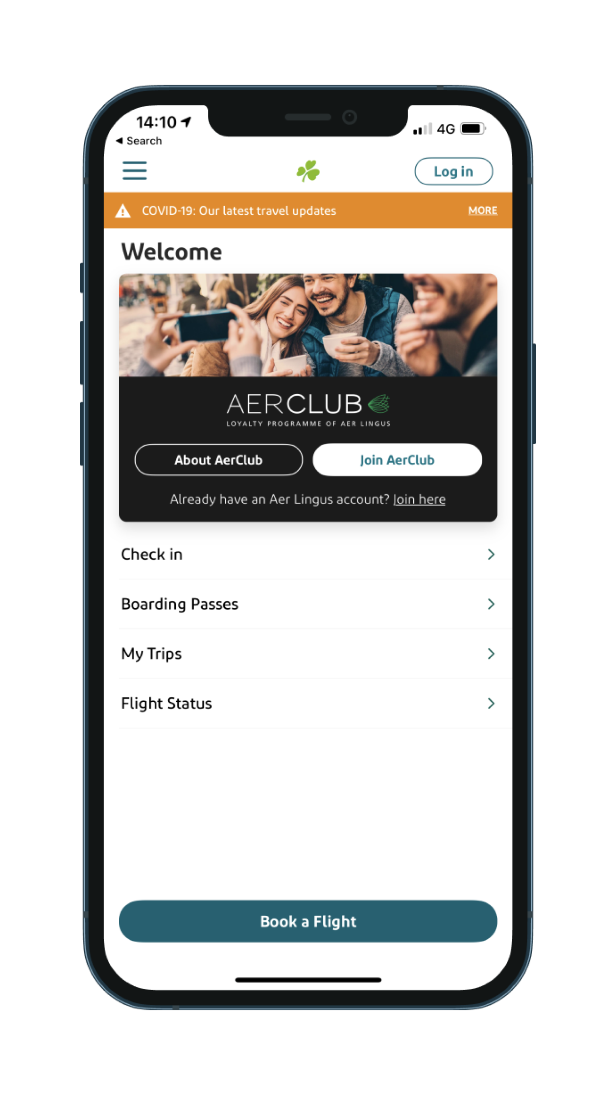
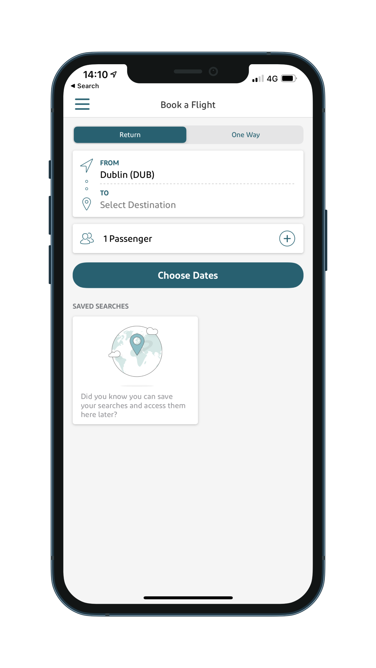
👓 As Is Walkthrough
I mapped out the As-Is journey as I wanted to see a bigger picture and understand the Aer Lingus app’s current flow. Images below show the process from the landing page to the last page after checkout. You can also check the full video.


I found out that the multi-city trip booking is not available on the mobile app. Even though there is something similar on the desktop version (check the video), it’s impossible to select more than two destinations, last destination being in the USA.

🗒 Heuristics Evaluation
To evaluate the app and point out all UI pieces that could be fixed, I used Nielsen’s heuristics evaluation checklist. They are called “heuristics” because they are general rules of thumb and not precise usability guidelines.

👀 Visibility of system status
✅ PASS
Every screen does begin with a title or header describing the contents, and labels are shown adequately. Messages appear in the same place on each menu, and selected icons are distinguished from not-selected ones.
🙁 FAIL
When booking a ticket, the app lets you select the date without flights – which is frustrating because, in this case, you have to go back and guess which dates have flights: trial and error.
📋 Consistency and standards
✅ PASS
No uppercase letters have been used in the app; abbreviations don’t include punctuations, and icons are labeled. There are no more than 20 icon types, and every window has a title. Field labels are consistent from one data entry to another.
🙁 FAIL
Field labels disappear when you type in the content on the personal info page. For filled-in input fields, the only feedback from the app is a change of colour; no other legend is provided.
Sometimes the menu choice is not matching the menu title – for example, “Suggest improvement” becomes “Feedback” at some point in the flow.
⛔ Error Prevention
✅ PASS
Users can enter more than one group of data on a single screen, and data inputs are case-blind. Navigation between the screens is visible and straightforward. The system warns users if they are about to make a potentially serious error.
🙁 FAIL
Again the same, when booking a ticket, the system will let you select the date without flights – and then on the next step, you find out that there are no flights on the selected date.
🆘️ Help and documentation
✅ PASS
Data entry screens are supported by navigation and instructions; the visual layout is well designed. Instructions follow the sequences of user actions.
🙁 FAIL
There is no help link available on every page. Once you access the help page, the session is finished, and you cannot continue where you left off.
📊 Market positioning – Innovation Map
In order to set the identity of a brand so users see it in a certain way, I used the market positioning map. Even though there is a vast area to cover in either evolutionary or revolutionary square for existing and new offerings, Aer Lingus seems to sit on the edge – behind his big Irish competitor RyanAir.
This meant there is plenty of ways to improve, and by introducing the feature all customers are desperate for – Aer Lingus app could push its competitors behind.

⚔️ Competitor Analysis
To identify competitors’ strengths and weaknesses, I decided to conduct a brief analysis of Aer Lingus’s competitors. In this way, I hoped to improve the design decision and deliver a better product solution. I looked into RyanAir and tested SkyScanner with users later on.


🚀 Opportunities
All common features came up from the conducted research and what the competitors do right and wrong. When those are compared with the Aer Lingus app, it’s easy to map out the areas that can be improved:
-
- Search for multi-trip inside the app
- World map with possible destinations
- Multi-trip monthly view
- Checkout/purchase with Apple Pay/Google Pay
💥 Big Ideas
Having all the features listed above, I’ve decided to place everything in one place and call this board “Big Ideas.” Even though it’s less likely all these features will ever be available in the Aer Lingus app, it will help to visualise them in one place and focus on the most important ones – those that should solve users’ problems with the Aer Lingus app.

📋 Surveys
After four days from publishing, 58 responses were gathered all together. Here is what I’ve learned from the responses received:
87% - have flight cost as a priority
68% - searches at an airline app
60% - have done multiple destination trips
43% - thinks searching multi-trip tickets is moderate
87% - would change flight date for a better price
90% - visit 3 destinations
90% - has a price as their main priority
90% - are flexible with order in which they visit destinations
90% - are flexible with dates
🎤 User Interviews
Using this quantitative method, I tried to measure how well a user can complete a certain task and reveal the possible problems they encounter. I was also aiming to get a better insight into the things that user likes and doesn’t like on the web site and mobile app.
🧩 Findings
Here is an example of the findings after the interviews. Next step is analysing the data and narrowing down to find the key problem to focus on.
✈️ Aer Lingus app – Round Trip journey
- Uses SkyScanner mostly to search for the flights because she has wider picture
- Didn’t do multi-city trips so far
- Uses desktop version when searching for the flight because has more info and can open more tabs if wants to search for more flights at once
- Likes the fact that she can see prices for more days at once even on the mobile app
- When booking the flight, she takes the basic/cheapest option
- Doesn’t really like the fact that she has to put all her personal details
- Hates dark patterns (tick the box if you don’t want to receive)
“I hate when they do this! Like, you’re supposed to tick the box if you WANT TO receive, not the other way around! That’s a tricky one” - Doesn’t see the reason to give her phone number because they never contact her via phone
- “Why do I have to select the tittle? Why do you need the title? Doctor??”
- Would pick the seat only on long destinations, not for the 2 hour flight
- “I would remove the phone number and the title”
- Would like to have an info for the dates when there are no flights
- Seat selection isn’t clear.
✈️ SkyScanner – Multi-City Trip
- Would use SkyScanner for multi-city trip
- Likes the “take me anywhere” option on SkyScanner
- Would prefer to take direct flight rather than stop-over, even if it would be more expensive
- Likes the monthly view with prices
- Likes the fact that she can choose between different airports in one city
- Trial/error to find the best prices
- Struggle with complex/unnecessary input fields.
- Multi-trip search requires memorisation, trial/error.
- Frustrated when the company tries to force extras.
- Confusion with price system.
- You can select dates with no flights.
- Trial/error to search for best prices.
- Can’t edit details later.
- Confusing fields (title / phone).
Problem statement
How might we provide a better way to search and book cheap flight tickets for multi-city trips on Aer Lingus Mobile app
THE DEFINE PHASE
👟 Stepping into users’ shoes
In the second, Define stage, my focus was on filtering and working through all the findings gathered in the previous stage. This means narrowing them down, identifying the bottlenecks, and creating a list of the problems and opportunities to focus on.
After getting feedback from the surveys and all the data from our interviews and usability testing, I created a segmentation table based on the categories listed below.

👤 Creating a user persona
From the data I analysed, I created two user personas – Mario and Conor. They will represent the actual target audience derived from the data gathered in user interviews and surveys.


🚗 Mapping the As-Is scenario
Once the personas are ready, it’s time to begin to think about what they do. Mapping the As-Is scenario involves asking what is the user doing, thinking and feeling throughout his or her experience with Aer Lingus app.


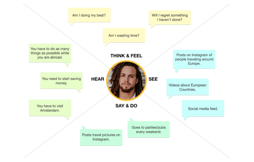
🎭 Empathy Map
I used empathy map to enhance the empathy towards the user and discover the possible gaps in the research. It also served as a quick way to show users’ behaviours, thoughts, and attitudes to other members of the team and stakeholders.
From this I understood that users don’t want to waste time, they want the booking process to be as easy as possible.
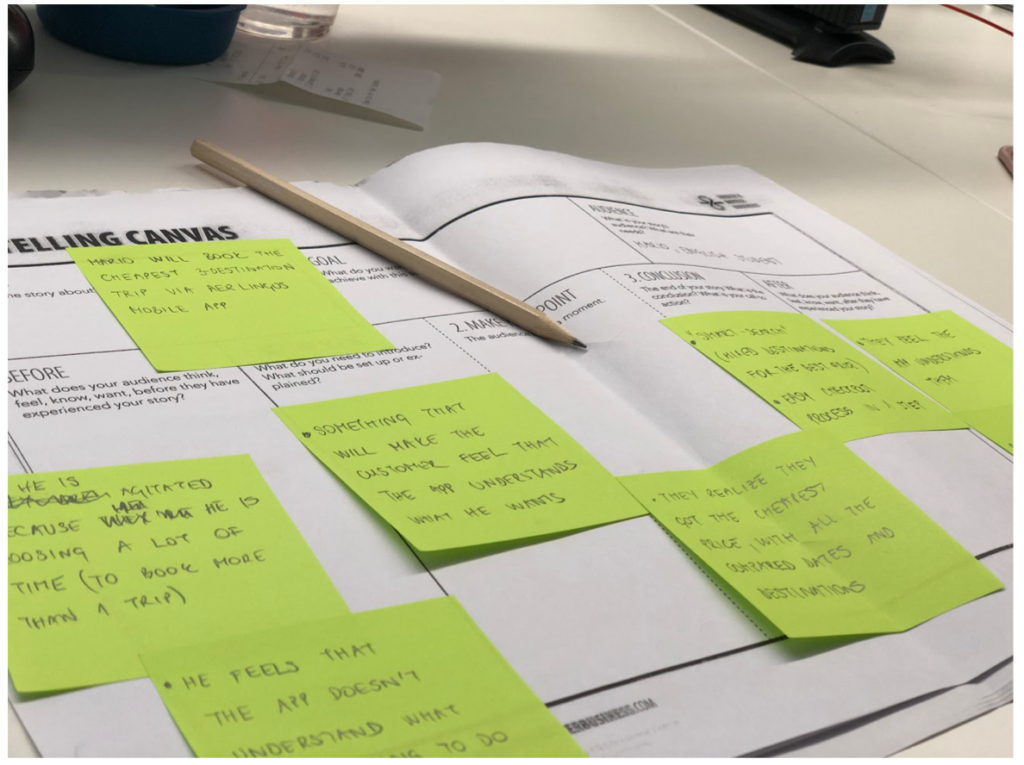
🛤 Storytelling canvas
The storytelling canvas proved to be extremely helpful because it’s challenging to choose the right tools to shape the solution without a clear idea of the story itself. There are several questions listed in canvas, and only after answering them was it clear that my target users don’t want just an app to book the flight. They want the entire experience, the app that understands their needs and knows how to search for the best deal.
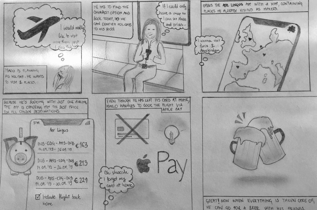
🏞 Storyboard
A storyboard is a tool that visually predicts a user’s experience with a product. The main journey of the target user is clearly visible in the storyboard below, which will be a guiding star when creating the design.
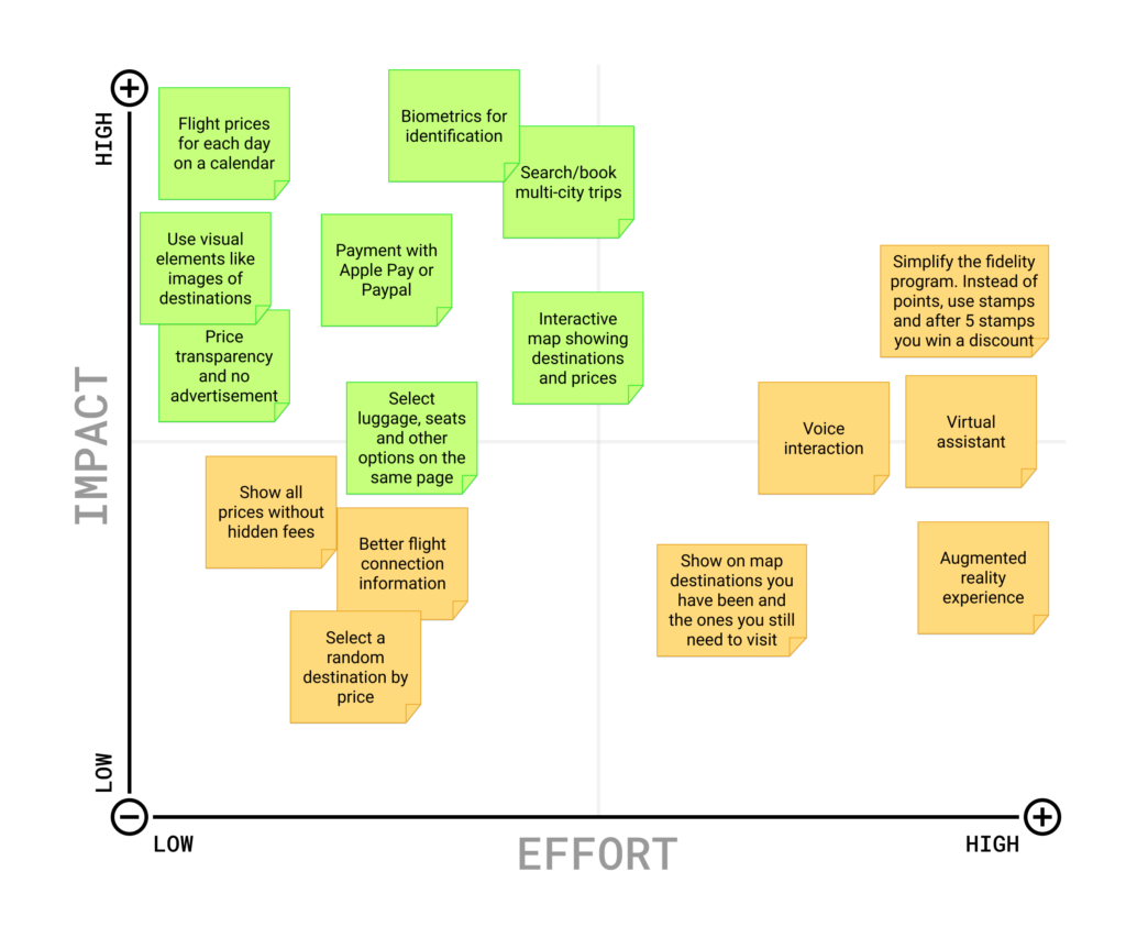
📌 Prioritisation Matrix
The best way to map the features and improvements that require less effort and bring more value to the product – is by using the prioritisation matrix. After going through the feedback from users and other findings, I’ve put all ideas inside the matrix. The items in green below are the ones that I will focus on.
THE DEVELOP PHASE
🖍 Let’s design. Finally 🙂
The third stage of the Double Diamond design process marks the start of doing actual design, i.e., making the solution to the problem outlined in the first two stages.
🛫 To-Be Scenario Map
I’ve used the scenario mapping method to outline all the steps a user will take while executing a task.


From this exercise I outlined the following steps I should put my focus on when designing the solution:
- Displaying the prices above each date
- Displaying only the available dates
- Make the seat and luggage selection clear, without any ambiguity
- Ask only relevant personal info
- Review the info before payment
- Easy payment option (Apple/Google pay)
🗒 Paper Prototyping
As all ideas and feedback are gathered, it’s time to start sketching and creating the first low-fidelity paper prototypes. In this stage, it was important to make sure the flow is correct and the main CTAs are in place.

⏳ Low-Fidelity Prototyping
The first interactive prototype ended up being a slightly better version of the existing app with an easier flow. After user testing, the feedback I received was to make the experience more emotional by extending the map and showing the destination prices.
After first iteration, I created a new prototype with a bigger map containing prices and planes when the destination is selected, with the improved flow showing the dates and travel extras.


THE DELIVER PHASE
📱 Final Product
The fourth and final stage of the Double Diamond framework is Deliver.
This is where I’ll try few different ideas from the previous stage, reject those that are not accepted and iterate on those that users will like.
👫 Participants
From the data collected during the survey, it was easy to outline what the target demographic is. This will help me in recruiting suitable participants.
Frequent Travellers wanted.
Age: 25-45
Gender: Male or Female
Nationality: Any
Technology Skill: Any
Each participant was given two tasks:
- find and book the cheapest return flight to Paris,
- find and book the cheapest multi-city flight to Paris and Amsterdam
🔍 Analysing the data
After getting the feedback from 19 participants, the best way to organise them seemed to be through the affinity diagrams.
This exercise resulted in gathering a shared understanding of the users’ problems. Also, thanks to affinity diagramming, I had a better insight into the common issues repeated between the participants.
Below is an example of some that repeated.
Affinity Diagram


⌛️ High-Fidelity Prototyping
Even though users liked the high-fidelity prototype, they didn’t notice the planes moving. This phenomenon is called “change blindness,” which is people’s tendency to ignore the changes when they happen far away from their focus.
The only way I could fix this problem was by using animation in critical places to highlight the movement and direction the traveler is going.
🪜 Iterating towards the final product
The way people say they will behave in any given circumstance and how they actually behave are two completely different things. After testing the actual prototype with users and getting honest feedback, I found things to be more tangible and concrete.
The final product I eventually came up with is a mixture of ideas approved by feedback received from targeted users. It’s a product that got finalised after so many iterations, and each one of them made it a bit more perfect than it previously was.
However, it’s silly to call this the end of the design process. The game is still on, and the research, prototyping, and testing should still be happening, along with the iteration.